The docklands sailing and watersports centre exists in the shadows of canary wharf, serving a diverse local community made up of local schools and youth programs to corporate events for multi-national banks. The brief was to create an identity that appeals to the wide ranging user base whilst emphasising a sense of community spirit.
The starting point for the logo was a life ring. This was then broken apart to create several different lockups to work across all different types of canvases, from flyers to sails – inspired by the fluidity of water.
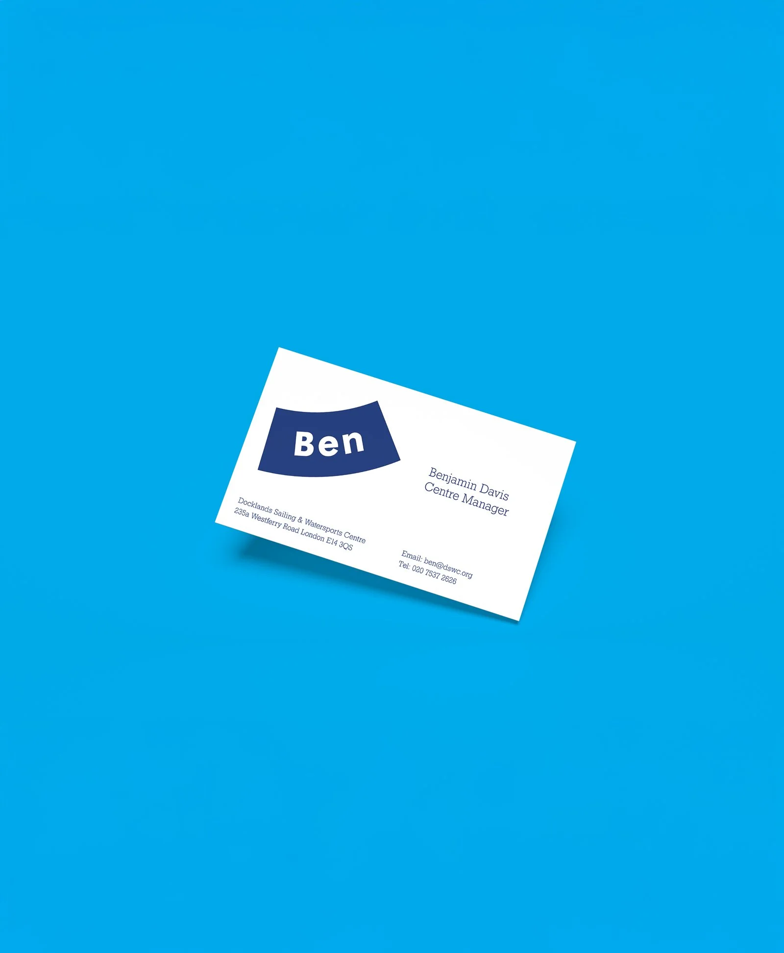
The logo can then extrapolate to incorporate different words across various functions so that the identity is always present, without having to display the logo.
A portfolio of double sided flyers were created using lino printing. The shapes were graphically arranged so the negative space forms a sail, kayak, sailing boat or a splash for youth activities.